There's a lot that goes into designing a digital signage presentation, in this post were going to go over and talk about a few factors to pay attention to when designing your presentation.
1. Color
“Color does not add a pleasant quality to design – it reinforces it.” — Pierre Bonnard
It’s kind of funny the quote above is from a french printmaker who lived during the late 19th and early 20th century. Just like color influenced his paintings and prints it should be importantly considered when planning your digital signage presentations. Color is the first element the mind sees and the last it forgets. Our minds associate certain traits with color as well. Check out this infographic from www.psychologia.co to see what traits are associated with different colors.
Another factor to take into consideration is that certain colors clash when paired whereas others compliment, a good tool to use to pick which colors to use is the Adobe Kruler it will show you all kinds of different color combinations that work.
2. Typography
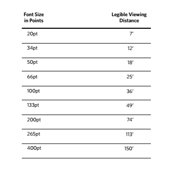
This is one case where size does matter. A common mistake in digital signage and one that you have probably noticed while trying to read the tiny font on a menu board, or campus directory. Below is a chart for font size and viewing distance that you should follow when deciding how large the font should be on your display.

Another useful tool is this graphic for pairing typefaces, it goes through a bunch of the Google Fonts and shows you the compatibility levels of different fonts.
3. Timing
Timing isn’t really part of visual design, but it is important in how you design your presentations and displays. For example you don’t want a breakfast menu displaying at dinner, and you definitely don't want the same content displaying all day every day because people will stop engaging with it. If your signage is showing the same information every day try and find different ways to display the information, you can try using different images, videos, text, but don’t leave the same thing up for too long or risk losing engagement.
4. Interactivity
Interactivity doesn’t necessarily mean that the user needs to be able to push a button on the screen, but your presentation should engage people that could include having calls to action like “Learn more here” with a scannable QR code, or “follow us on twitter: @RiseVision”. The Rise Vision platform does support interactivity. Contact us to learn more about multi page presentations, great for kiosks, hotel lobbies, restaurants, car dealerships, etc…
5. Content
“Content is king.” - Bill Gates.
This is incredibly true, content makes or breaks a display. It takes all the other factors into consideration and combines them. Boring content, no one will pay attention, to much content no one knows what to pay attention to, you must walk a fine line with your content.
This is an HTML presentation. View it live here.
This presentation has a lot of different pieces, and is showing lots of information but the content is well designed, and presented. Which helps it to easily convey it's message to the user.
By following these tips and implementing them into your signage design, your communication with your customers should improve and your free signage should attract more viewers.
Want more digital signage design resources? Check out the links below!
- 101 Digital Signage Content Ideas
- How to Use Color Theory in Digital Signage Design;
- Golden Ratio for Digital Signage Design
Get Your Message Noticed.SIGN UP NOW


