No matter what happens, consumers will always frequent grocery stores to stock up on goods for their homes. So whether or not it’s a lucrative business is an easy answer. But with the sea of grocery store chains now in the market, the question now is how you can stand out and make your grocery store the go-to for consumers in your area.
The key? Enhancing customer experiences. In addition to putting more goods on store shelves, organizing aisles, streamlining checkout, and offering deals and discounts, among others, adding grocery store signage can help engage customers and make their trip to your store easy and enjoyable.a
Recent years have seen an influx of retailers investing in digital signage solutions, with grocery stores considered the best live places for digital signage content. You may already have some signage solutions in your store, but are you maximizing their impact by staying up to date on the best practices and trends?
The main draw of a digital signage solution is its dynamic nature, allowing you to show fresh and innovative content every time. To keep your grocery digital signage new and engaging, here are some trends you should know about.
The Latest Graphic Trends in Digital Signage
Digital signage capitalizes on design elements to attract attention and communicate a message. As such, it is heavily influenced by changes in design trends and practices. Among the latest priorities in graphic design include playing with color, using bold lettering, and focusing on cleanliness and readability.
Color of the Year
Grocery stores commonly go for warm, earthy color palettes that help them represent the quality of their goods. But this year, graphic design trends are leaning more towards bolder and brighter colors and are taking inspiration from the trending color of the year.
For 2023, Pantone declared Viva Magenta as the “it” color, so it might be well worth it to incorporate it into your digital signage content.
Lettering
Grocery stores span a large land area, so big and bold lettering is crucial to ensure your digital signage content is visible and readable. You shouldn’t be afraid of having massive installations or three-dimensional letters in-store to catch your customers’ attention and create a contrast for your cluttered aisles.
Clean and Readable
A supermarket is a feast for the senses, with lots of things to see, smell, touch, and hear. With all these distractions, it’s easy to take attention away from your digital signage content. Minimalism is key in grocery store signage — prioritize legible and clean designs that don’t take too much effort to consume.
Design Themes in Grocery Store Digital Signage
Your supermarket's digital signage should contribute to the store’s ambiance. Whether you’re going for a vintage, organic look or highlighting your eco-friendliness and local offerings, there’s a theme that will suit the aesthetic you’re trying to achieve.
Here are the most popular design themes today.
Handcrafted
Recent years have seen consumers favor handmade or handcrafted goods, proven by how Etsy, an online marketplace for handcrafted items, saw a 110.07% increase in revenue since 2019.
To take advantage of this trend, you can opt for a handcrafted aesthetic in your grocery store digital signs. They express authenticity, sustainability, and creativity — characteristics that consumers are finding more and more appealing.
Hyper-Local

Recognizing the impact of supporting local businesses in the economy and environment, consumers are now demanding that supermarkets take a more hyper-local approach, offering local goods and referencing local trade in their establishments.
This is why grocery stores in different areas no longer take the cookie-cutter route to branding — they’re now incorporating unique designs that highlight the culture, architecture, and imagery in their localities.
Take Trader Joe’s, for example, which depicts local history through hand-painted murals on its walls. Or Whole Foods in Los Angeles that incorporated the architectural design of the city’s famous Union Station.
Vintage
Design trends from the past are circling back and making their mark in the modern day once again. Creating a warm feeling of nostalgia, vintage and retro designs are always welcomed by American consumers. Go back in time and revive the vintage theme in your grocery stores by incorporating farmhouse or atomic-age motifs in your digital signs.
Simplicity
Grocery stores have a reputation for being another hectic addition to an average consumer’s already long list of errands and responsibilities. Ultimately, what consumers are looking for is simplicity, something that will make their decision-making easier.
As an Accenture customer sentiment article puts it:
“Amid the pressure of life forces and the chaos of everyday life, what customers ultimately need is simplicity. They are drawn to anything that cuts through the noise and makes their decision-making—and their lives—easier.”
This principle applies to digital signage as well. Aim for a fresh, clean, minimalistic theme without all the bells and whistles of loud colors and prints — make grocery shopping a welcome respite amid the daily hustle and bustle.
Big and Bold
Grocery store signage trends are favoring large, show-stopping designs over small installations. They not only help make a sign more readable but also create high impact and facilitate a more immersive experience for shoppers.
These super-sized signage solutions are typically used to designate different areas of the grocery store, from bakeries and butcher counters to meat sections and the frozen goods aisle.
Grocery Store Signage Trends
Digital signage is finding its way into grocery stores. This year, it’s seeing increasing applications in the following areas.
Aisle Directories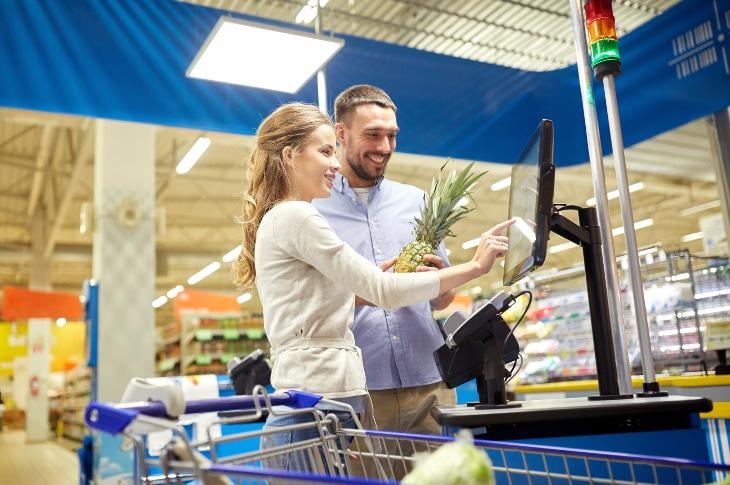
To make it easy for shoppers to find their way around, grocery stores are installing large aisle directories right at the entrance. Typically touch-screen displays, they allow those in a hurry to quickly identify aisles where the goods they're looking for are stored.
Banners
Banners are an easy and affordable signage solution that grocery stores are increasingly using to introduce special offers or products. While nothing new in the grocery store signage scene, they’re highly effective in making an impact and communicating messages, which is why banners are a signage solution that’s here to stay.
Checkout Signage
Checkout counters are the first things shoppers see when they walk into the store and the last place they go before leaving. Recognizing the impact of checkout counters on the shopping experience, supermarkets are using the area as an opportunity to engage their customers.
They’re outfitting checkout counters with digital screens and deploying engaging content to communicate a message and simultaneously reduce perceived wait times and manage the queue.
Floor Signage
During the pandemic, grocery stores used floor signage to implement social distancing measures. Seeing its effectiveness in communicating information, plenty of establishments retained their use of floor signs, only for a different purpose.
Now, you’ll find grocery stores promoting new products and promotions on the floor, with some even going as far as creating interactive activities to make shopping more fun.
Menu Boards
Usually installed in deli counters and food service operations, menu boards are streamlining the decision-making process for grocery store customers. They allow shoppers to see their options at a glance and can entice them to try out new products on deli freezers.
Most grocery stores display menu boards as video content, creating a dynamic and engaging display that’s easy to update as new products arrive in stock.
Perimeter Signage
Perimeter signage solutions such as soffits, wall vinyl, and dimensional lettering are helping supermarkets delineate different areas in-store and create visual impact. These large-scale installations make a grocery’s interior more upscale, communicating the quality of the store, its service, and its products.
QR Codes
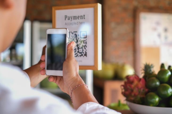
QR codes popularized during the pandemic have found a permanent place in grocery store signage solutions. They help merge physical and digital platforms, placed in screens or printed collaterals to allow a shopper to take their experience online and learn more about the store’s promotions, products, etc. long after they leave.
Wayfinding Signs
Large grocery stores can be difficult to navigate, even for customers who do their grocery shopping often. With all the different aisles and floors, it’s taking up a lot of a shopper’s time to find what they need. That’s why groceries are heavily investing in wayfinding solutions.
Whether digital screens or simple placards, wayfinding signs placed in strategic areas help customers navigate the store.
Window Clings
Grocery store windows are a fresh canvas for signage solutions. Supermarkets are using this real estate to mount posters or digital screens, beginning the marketing and communication strategy before the customer even walks through the door.
Upscale Grocery Store Experience with Digital Signage
The beauty of digital signage lies in its ability to future-proof your grocery store’s marketing and communications strategy. With a display that you change and update in real-time, you can capitalize on trends and communicate fresh and innovative messages to your shoppers.
As a result, you’re improving customer experiences in your store and setting yourself apart from other supermarkets in your area. And if you haven’t incorporated free digital signage in your grocery just yet, get started today with Rise Vision.


