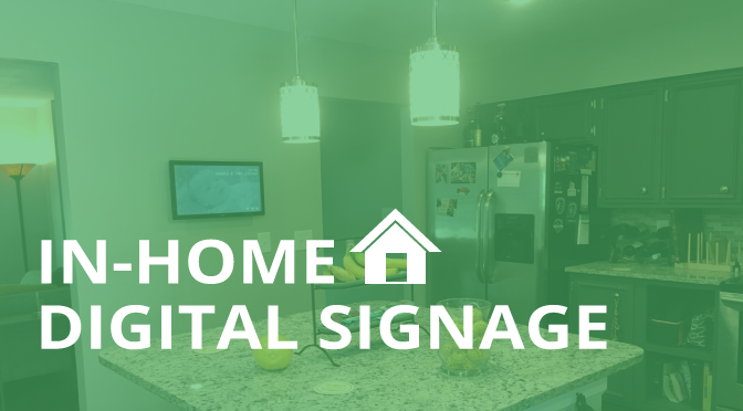
We have seen digital signage used in schools, universities, restaurants and retail shops, but now it’s making its way into the family home. Mat Meiers, one of our team members, has created his very own in-home signage project which he has designed to display calendar events, grocery lists, to do lists and family photos.
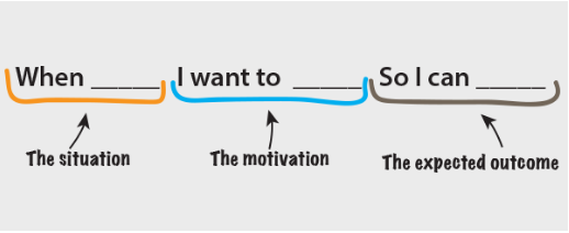
He explained his inspiration for the project using the Jobs To Be Done framework that we at Rise Vision all know and love.
“When I’m at home in my kitchen which is the main traffic area,
I want to be able to go to one centralized screen location (instead of several paper lists and calendars on the fridge and wall) ,
So I can view and add things to a calendar, grocery and to do list and see other pertinent information like the weather outside.”
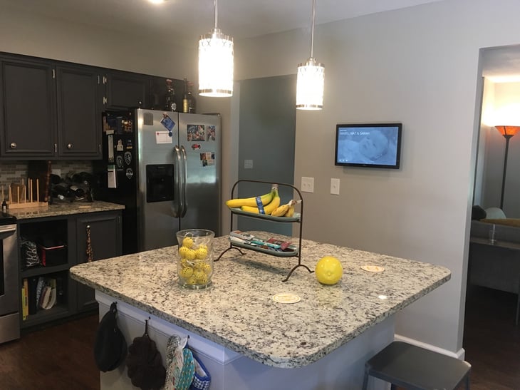
He has mounted an interactive display on the wall that faces his kitchen. Like most families, this is the busiest spot in his house. Placing it here makes it visible to guests and family on a daily basis.
The display has four pages; a homepage, grocery list, to-do list and calendar- the staples for every household- all of which can be easily managed and viewed.
Home Screen
When the display is in rest mode it fades to the home screen; an elegant slideshow of family photos, and the most important information for his day-to-day.
Here’s how Mat describes it:
“I wanted this page to be visually appealing to guests but still contain necessary information accessible at a glance without interacting. The background of the home page is a ken burns slideshow of family images. Overlaid on top is the current day's forecast and any calendar event that might be going on that day. I wanted the navigation and transitions to be unobtrusive and take up little real estate giving the focus to the actual content.”
The navigation in the right hand corner directs to the calendar, to-do list and shopping list respectively. He built the buttons in a similar style to Google's Material Design, using a clip-path property to reveal content as the user transitions between pages.
Here’s how he achieved the home screen:
- Image Slide Show: Simple Ken Burns on Flex Slider
- Current Weather: simpleweather.js
- Navigation: material VCard
Calendar
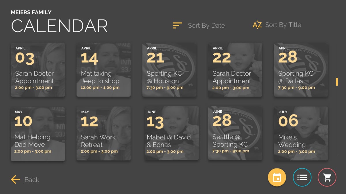
Many of us know what it’s like to manage a busy family calendar. Which is why Mat’s goal in creating this Calendar page was to make the family calendar easy to view, understand, manage and update, right from the kitchen.
“I would like to update my calendar via a shared google calendar that my family regularly updates and sort by date or title to find what I am looking for”
The simplistic style of this calendar makes it easy to manage the week’s events. The family member who is associated with the event on a given day has their photo appear in the background of the event. This way If you need to find out if you’re available, you can just look for your photo on the screen.
Here’s how he achieved the calendar:
- Import Google Calendar events into google spreadsheet: IFTTT
- Pull spreadsheet data into my html page: Rise google sheets component
- Sort and Search dates and events: List.js
To Do and Grocery List
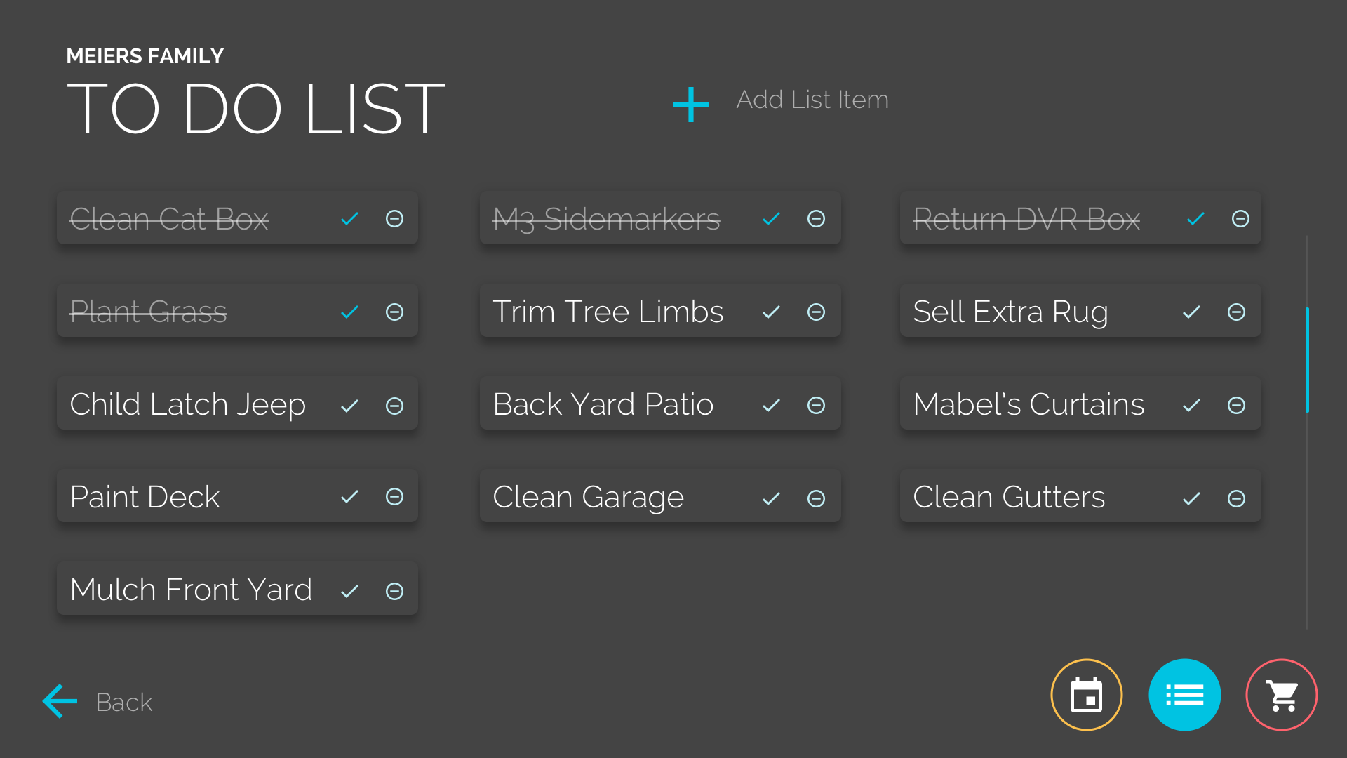
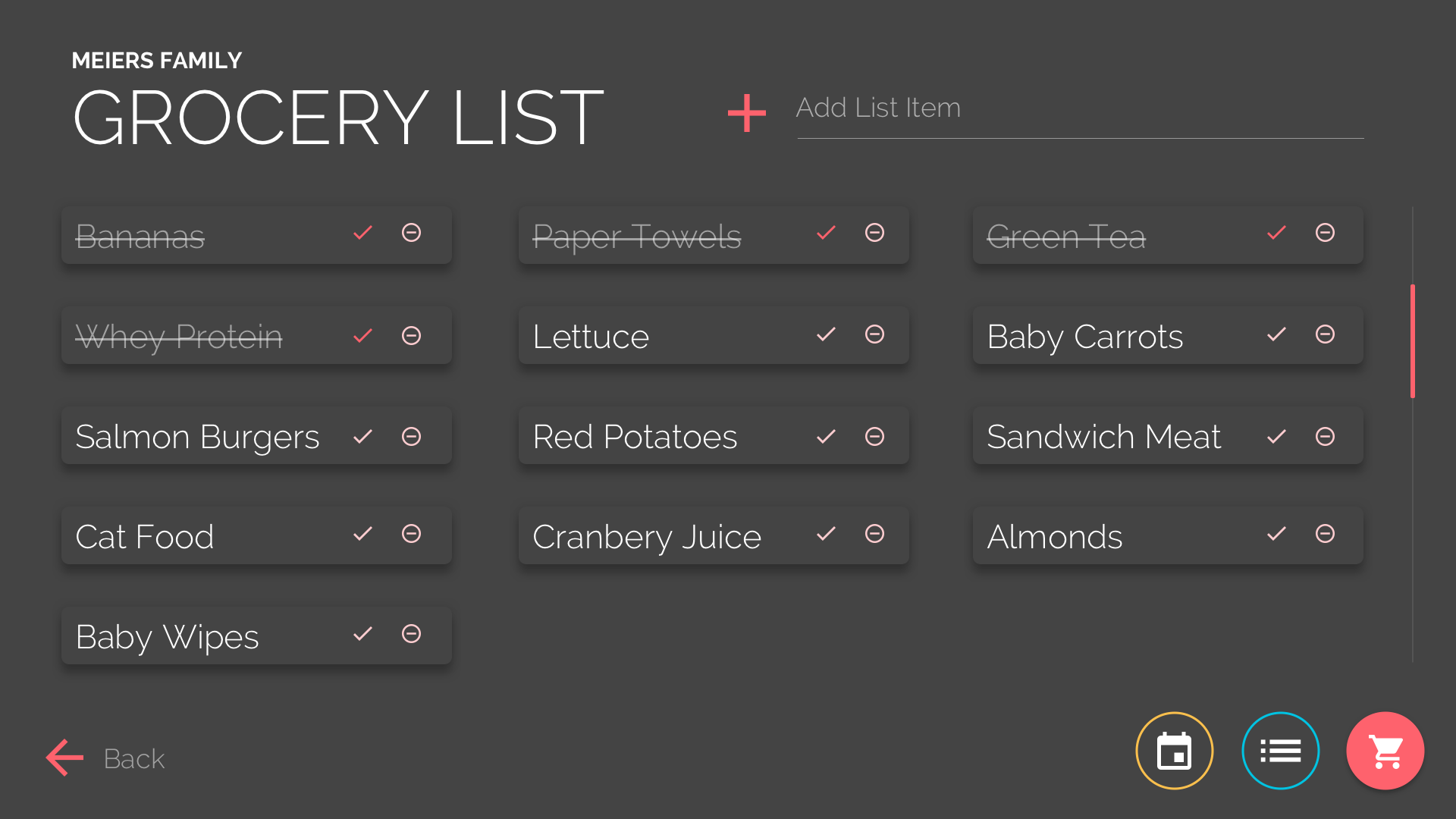
Say goodbye to loose grocery lists! Mat has solved one of the biggest household hassles with these pages. His To Do and Grocery lists make it painless to manage these tedious tasks.
“My original plan was to use the Rise Google Sheets Component and which would allow us to update the list through a spreadsheet. However, I changed my mind because I felt it would be better to create something that would encourage us to return to the screen on a regular basis as well as capture those spur of the moment thoughts while in the kitchen. I found a simple pen with a to do list that I used to create the list then I attached a JQuery onscreen keyboard so items can be added directly to the list from the screen.”
Here’s how he achieved this:
- To do List: Simple To Do List
- Jquery Onscreen Keyboard: Onscreen Keyboard
Planned Changes
Like anything in software Mats project is a work in progress, he plans on iterating and improving on his design over time. After using the display for a couple weeks, he’s already discovered a few changes he’d like to make to the design.
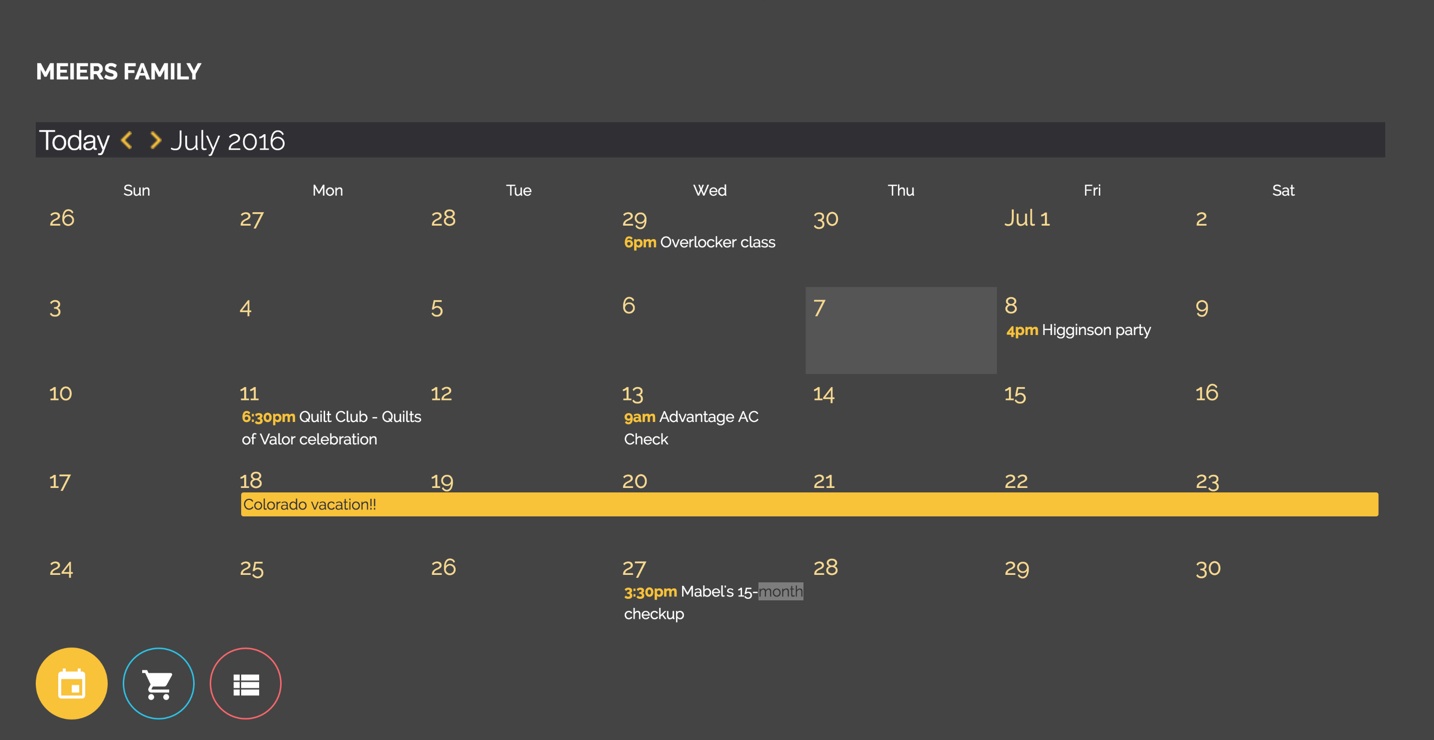
“After using the display for several weeks I’ve realized there simply is no replacement for a traditional calendar layout which visually shows you where a day falls on a month. While trying to plan a weekend trip my current layout fell short in scenarios where I would like to quickly discover if I have an open weekend in a month view. I have also realized importing calendar data into a spreadsheet firstly is less than ideal. I’ve been experimenting with customizing Googles Calendar Embed and also this: http://fullcalendar.io/.“
Here’s a sneak peek of where this is going:
He also experimented with some sketch.js examples to test the multi-touch feature of the screen after installing.
“After leaving it up for a few days I noticed my wife and 1.5-year daughter loved writing little notes on it.”
Now he plans to incorporate this as a hidden component on the home page so you can draw on the screen anywhere there are no buttons.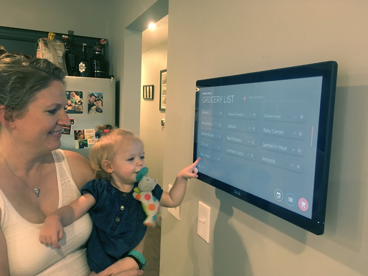
Mat’s simple in-home design is not only an attractive addition to his home, but it’s also eliminating the burden of managing a busy schedule. He’s keeping everyone up-to-date in a way that’s both manageable and effective.
Interested in digital signage for your home? Let’s chat! creative@risevision.com


